
Duration
5 Months
June 2020 - October 2020
Tools Used
Design- Figma, Adobe Illustrator
Collaboration & Research- Figjam, Miro
My Role
UX Research, UX Design, Ui Design,
Prototyping
Friendly reminder: All the key points are highlighted for your convenience and user experience
Overview
Rising global burden of cardio-pulmonary diseases demands preventative action. Current reliance on physiotherapists restricts reach and increases error risk. My UX focus: a tech-driven remote rehab experience for empowered patients and therapists – transforming the landscape.
Let's talk about the problem
WHAT INSPIRED US?
Daily PT practice revealed the complexities of analyzing cardiovascular data. A tangle of sensors, calculations, and equations fueled our desire to apply technology for a transformation.
WHY THIS PROBLEM?
Millions lose their lives to cardiovascular disease (CVDs) each year, making it the top global killer. Shockingly, 85% of these deaths stem from heart attacks and strokes. Low- and middle-income nations bear the brunt, with over 75% of CVD fatalities occurring there. Recognizing prevention's power, stopping CVDs holds immense global importance.
But does the problem actually exist?
LET'S SEE WHAT THE NUMBERS SAY
After a quick peer review of the problem, we moved on to a quantitative study among medical professional to validate the problem statement and under stand what exactly could be done better
Qualification of the Participants

How often did the participants used exercise testing as a clinical test?

On a scale of 1-5, how difficult do that participants find the process of exercise testing?

On a scale of 1-5, how difficult do that participants find the process of taking pre and post vitals for the test?

WHAT WE UNDERSTAND SO FAR?
01
Users understand the value of preventive exercise testing, yet their actions don't match. Engagement below 3 times a month reveals a significant gap between perception and reality.
02
Users struggle with pre/post-exercise vital measurements, raising a critical usability issue to tackle for a smoother testing journey.
03
Juggling patient monitoring and vital signs during exercise tests impedes execution. Careful process review required.
Problem Statement
Users find it challenging to seamlessly incorporate exercise testing into their preventive healthcare routine, as evidenced by infrequent utilization despite acknowledging its importance. The difficulties in obtaining vital measurements pre and post-test, coupled with the complexity of simultaneous patient monitoring and data collection, hinder the overall effectiveness and user experience of the exercise testing process.
Quest for Information
Gathering concrete facts for our product idea is comparable to finding a treasure trove. Our approach to research has been guided by the map below, revealing essential insights that form the bedrock of our understanding and our concept's development.

COMPETITIVE ANALYSIS
Our team conducted a thorough competitive analysis to gain valuable insights into the market for our IoT product aimed at streamlining cardiovascular testing through a dedicated app. We carefully researched and selected competitors who offer similar solutions to ensure the accuracy and relevance of our findings.
Each competitor was assessed based on essential criteria, including user base, years of operation, cost, key features, and notable observations. This table serves as a comprehensive reference point, enabling us to better understand our competitive landscape and make informed decisions about our product's positioning, pricing, and feature set. It reflects our team's collaborative effort to gather crucial data for strategic planning and product development in the dynamic field of healthcare technology.
Each competitor was assessed based on essential criteria, including user base, years of operation, cost, key features, and notable observations. This table serves as a comprehensive reference point, enabling us to better understand our competitive landscape and make informed decisions about our product's positioning, pricing, and feature set. It reflects our team's collaborative effort to gather crucial data for strategic planning and product development in the dynamic field of healthcare technology.

USER INTERVIEWS

USER PERSONAS
User 1: Patient

User 2: Therapist

Merging Insights with Creativity
CRAZY 8s
To kickstart our project, we initiated a dynamic brainstorming session by employing the "Crazy 8s" exercise. This creative exercise involved our team members individually generating use case scenarios and conceptual screens for our IoT device and accompanying application. In just a short span of time, each team member produced eight unique ideas, fostering a rapid exchange of innovative concepts and perspectives.
The exercise not only ignited our creativity but also encouraged us to explore a wide array of potential user experiences and functionalities. These initial ideation sessions were instrumental in shaping the foundation of our product development process, setting us on a path to envision, refine, and ultimately deliver a comprehensive solution for streamlined cardiovascular testing.
The exercise not only ignited our creativity but also encouraged us to explore a wide array of potential user experiences and functionalities. These initial ideation sessions were instrumental in shaping the foundation of our product development process, setting us on a path to envision, refine, and ultimately deliver a comprehensive solution for streamlined cardiovascular testing.
.webp)
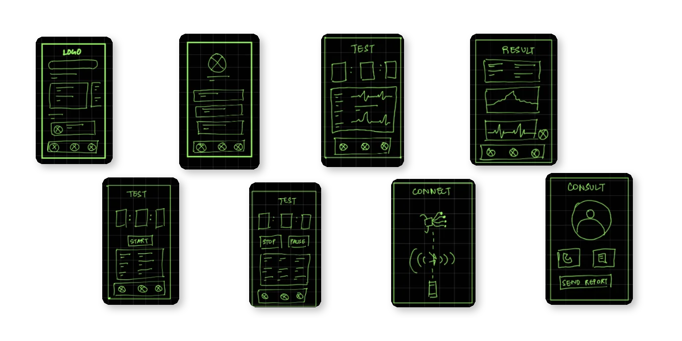
Creating Initial Paper Wireframes
HARDWARE DESIGN

SOFTWARE DESIGN
Moderated User Testing
PROCESS
Following the establishment of our user flows through collaborative efforts and paper prototypes, we promptly moved on to a moderated user testing phase. This involved engaging a diverse group of participants, including three patients and five therapists, to comprehensively evaluate our application's usability and functionality. During these sessions, we guided participants through the paper prototypes, gathering invaluable feedback on the user experience.
Our moderated approach allowed us to closely observe user interactions, identify pain points, and gain insights that were instrumental in refining and enhancing the application's design. These user testing sessions played a pivotal role in ensuring that our product effectively met the needs and expectations of both patients and therapists in the context of cardiovascular testing.
Our moderated approach allowed us to closely observe user interactions, identify pain points, and gain insights that were instrumental in refining and enhancing the application's design. These user testing sessions played a pivotal role in ensuring that our product effectively met the needs and expectations of both patients and therapists in the context of cardiovascular testing.
WHAT WE LEARNED?
We employed an affinity map to systematically organize and categorize the valuable feedback we received, as illustrated in the accompanying picture. This visual tool enabled us to group related insights and observations into distinct categories, allowing for a structured analysis of the user feedback. By doing so, we could identify recurring themes and prioritize areas for improvement, ultimately guiding our decision-making process and driving the iterative development of our product.

Creating the Mid-Fi Wireframes
BRIEF OVERVIEW OF THE DESIGN SYSTEM
Based on all the feedback we collected from our previous testing we moved on designing the medium fidelity wireframes. We had already decided on the flow and we delegated the work so that there was no overlap and we saved time.

Bringing Ideas to Life: Hi-Fi Prototypes


HI-FIDELITY SCREENS

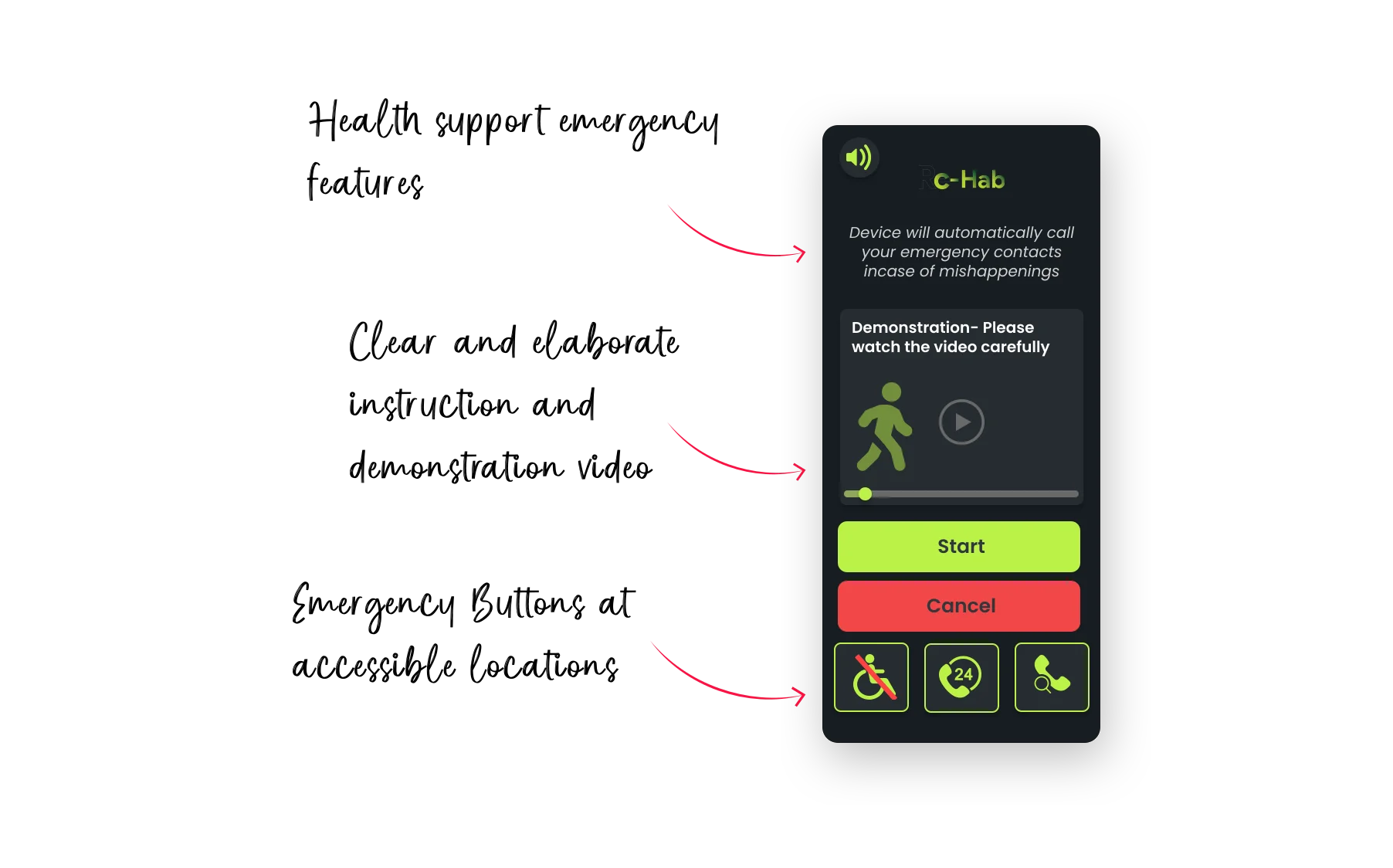
Accessbility Mode
We realized that our product would be mostly be used by people with cardiac diseases and its sequale. Our major customer base could include:
01
People with poor motor dexterity
02
Geriatric Population with poor vision
03
People with poor digital literacy
So we had to make the product more accessible. After brainstorming we decided to add an accessibility mode. We requested 3 people with permanent, temporary and situational disabilities to complete. Another usability and we identified all the problems that they faced while complete the tasks assignment to them.


.webp)
My Learnings
MY LEARNINGS
This project solidified my commitment to user-centered design. Prioritizing user needs became fundamental, thanks to teamwork (Crazy 8s, testing), and high-fidelity prototyping for UI refinement. Affinity mapping's insight fueled design progress, while adaptability became my armor in the dynamic project landscape.
WHAT I WOULD CHANGE?
Earlier low-fidelity testing and co-design sessions would have deepened user integration and identified issues sooner. Emphasizing accessibility upfront would foster inclusivity. In-depth research like interviews and ethnography could unlock richer user understanding. An iterative, well-documented approach will guide future projects towards even greater user-centricity and effectiveness.